Welcome to my blog, where you can find all of the research and planning which has been used to create our final promotional package, along with demonstrations of our construction and exhibition and evaluations of the 3 texts. We have created our music video to the track 'It's OK' by Atomic Kitten, and it is accompanied by ancillary texts which include a digipak and magazine advertisements.
Monday 24 March 2014
Sunday 23 March 2014
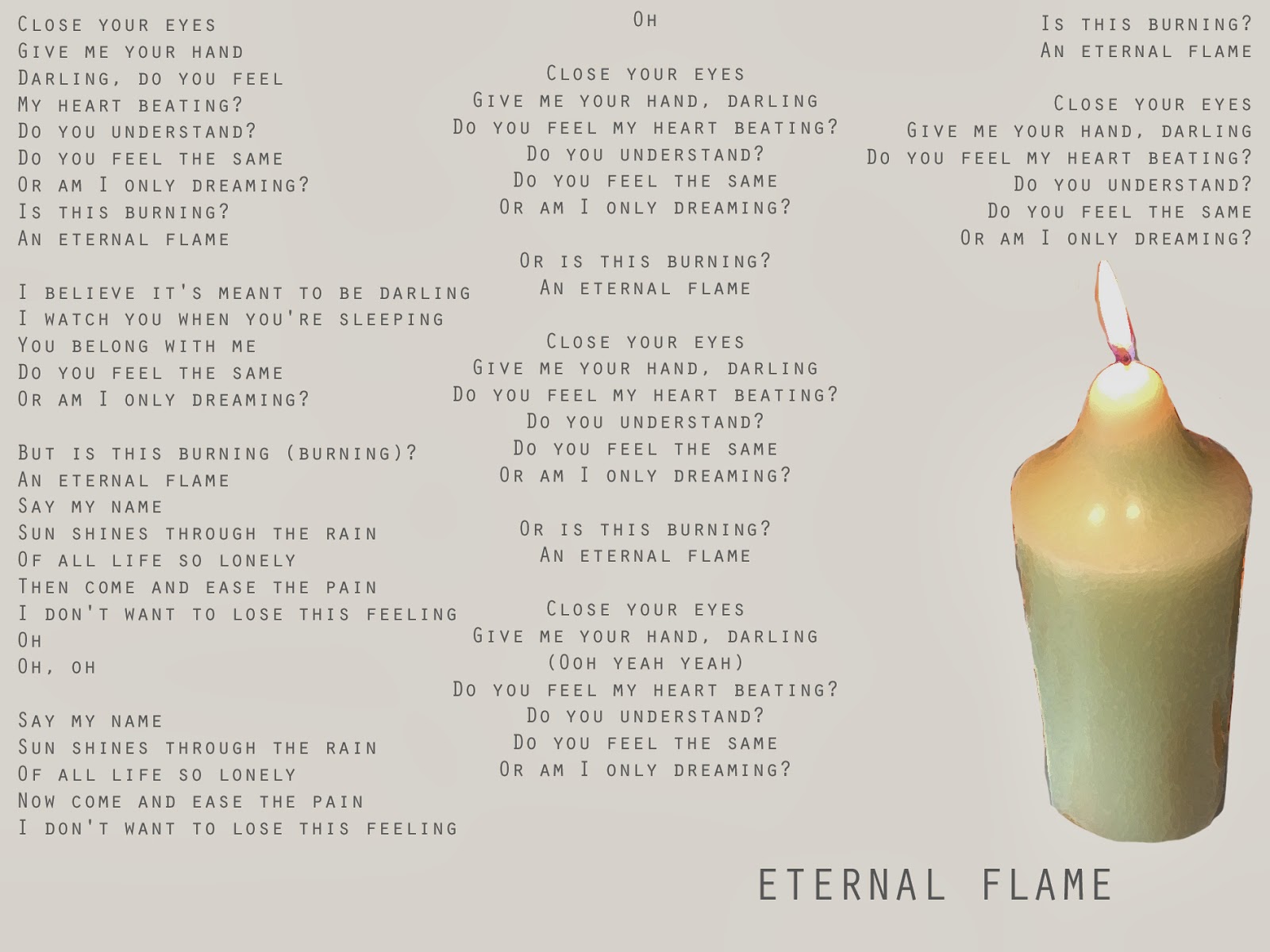
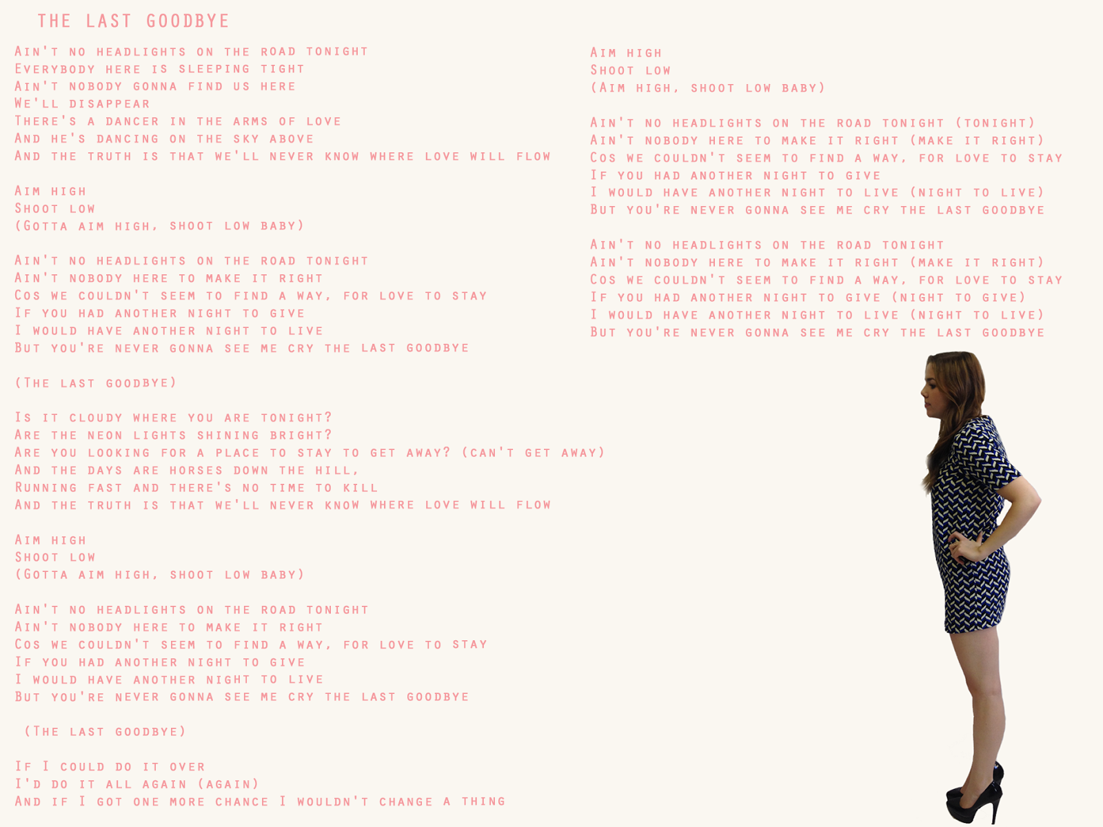
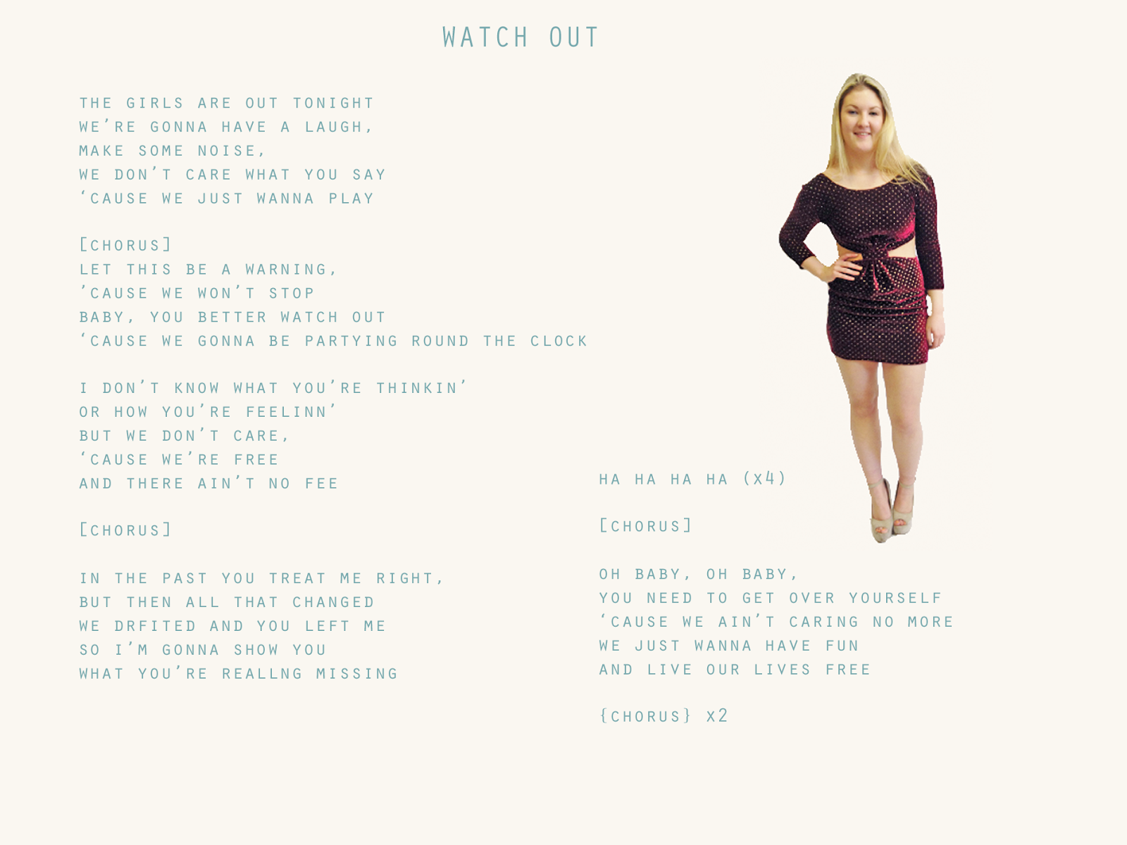
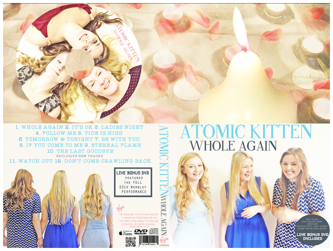
Final Digipak with Lyrics Booklet

We chose to include a lyrics booklet in our digipak too, as it is a common convention seen across them. Our target audience of teens are also likely to be the kind of audience to want to sing along and mimic atomic kitten and want to aspire to be famous like them. By creating a lyrics booklet they can learn the songs and sing along, and the booklet also includes images of the group that are new and unique to this booklet:
 |
| Front Cover |
 |
| Page 1 |
 |
| Page 2 |
 |
| Page 3 |
 |
| Page 4 |
 |
| Page 5 |
 |
| Page 6 |
 |
| Page 7 |
 |
| Page 8 |
 |
| Page 9 |
 |
| Page 10 |
 |
| Page 11 |
 |
| Page 12 |
Saturday 22 March 2014
Final Magazine Advertisements

Our final main mag ad features an image of the group together. We chose this image as it signifies a 'girl power' theme and shows off the group as a united front, and therefore felt it was appropriate to our style. We have also included an image of the digipak, as this is the sole purpose of the mag ad. We included tour dates, our social networking username and a QR code, which links to our twitter page, too, which provides the readers with information about the upcoming release.

As well as our group ad, we created 3 individual main ads too. It is common for artists to pay for more than one advertisement in the same issue of one magazine, to catch the readers' attention even more, and so we decided to create more than one main ad, to distribute in one issue of the same magazine, to advertise the products even more. For this ad, we used a different outfit, one which is also featured in the digipak, to add to the visual variety. The dress reflects the male gaze theory, as it is short and and cut out in the middle, and the pose is a feminine pose, to attract our secondary male audience. All the same information is included on this ad as the group add.

This is our second individual mag ad. This image was shot at a different level, to add more visual variety, and the dress is one of the same blue dresses featured in the video and digipak, to link the texts together. The direct gaze is a feature commonly used by pop artists, and so we felt it worked effectively to have this member looking directly into the camera, to create a relationship between the fans and the group/member.

This is our final main mag ad, which features similar conventions that we used in the other 3 main ads. We opted for using one of the blue dresses seen elsewhere again, as it is patterned and so is more eye catching and stands out to the reader. In contrast to the second individual ad, we used an image with the member looking away from the camera. We positioned the image so that she is facing the text, which we thought worked appropriately as it creates an effective link between the image and the text.


In this ad, we have layered two images of rose petals and tea lights, taken from the video. The two images are the same images, but we simply reduced the opacity of both, and changed the position of one of the images to give a 'double effect'. Underneath these layers, we added an image similar to the one used on the back on the digipak, which again creates a link between the texts. The QR code is featured again, to build up the excitement and provide the opportunity for gaining information if the audience choose.


In these 2 mag ads, we have used different images of a kitten. We felt that this was appropriate because of the current and growing social media phenomenon involving funny cat images and videos. Because the groups name is 'Atomic Kitten', we thought that including these images would create and effective link between the group name and this phenomenon. The phenomenon has taken up across all social media sites and so people of all ages (who use social media) will recognise this link. In one of the ads, we also included the rose petals, to link the 3 texts together in a subtle way, as well as including the QR code and twitter name/logo (to take into account those who do not have access to a QR code scanner).
Friday 21 March 2014
Evaluation Question 1 - Conventions
In What Ways Does Your Media Product Use, Develop or Challenge Forms and Conventions of Real Media Products?
This evaluation question includes 2 vodcasts and 1 prezi:- How conventions were used in our video
- How conventions were used in our digipak
- How we challenged/used/developed conventions in our digipak
The music video is the primary product of our coursework, accompanied by two ancillary texts (magazine advertisements & digipak). These 3 texts all share loosely linked conventions and imagery to link them together, although they each have their own conventions too, which they follow and challenge. Below, I shall be using my knowledge gained from the groups research and planning to discuss these texts and their conventions, and how we have used and challenged them to fit appropriately with our products.
To begin with, I shall be looking at both the general and genre specific conventions that are commonly seen in music videos.
MUSIC VIDEO
General Conventions
 |
| Lana Del Rey lip syncing and looking into the camera lens - an example of Direct Gaze |
Most videos tend to involve lip syncing and a direct gaze. This means that the singer(s) will look directly into the camera whilst lip syncing, to create a relationship with the audience. Lip syncing can be incorporated into a video in many different ways too. Some videos are solely performance, and so the lip syncing will act as though the artist is singing in a stage/professional setting. Others include the lip syncing into the narrative and/or concept, rather than on its own.
 |
| Rihanna |
 |
| Two of Lady Gaga's outfits in 'Telephone' |
 |
| Alex Turner is the lead singer of the Arctic Monkeys and is featured the most in the video for 'WYOCMWYH'. |
A large number of music videos often begin with a diegetic introduction and/or feature diegetic interludes. A diegetic introduction means the music doesn't begin straight away. A narrative will often play with diegetic sound until the track plays. A diegetic interlude is when the track will pause during the song, but there will be a continuing narrative and diegetic sound introduced until the track plays again.
| 'Miami Vice' titles |
 |
| 'Reaching Out' titles |
Genre Specific Conventions
Once I had determined what to generally expect from a music video, and once we had decided upon our song as a group, we set about researching the genre specific conventions so that we could apply and challenge these in our own production. These are just a few of the common conventions that were recognised during research:
Pop videos tend to be colourful and bright which is eye catching and engaging, and also often involve different transitions and effects, which keeps the pace of the editing consistent and fast. These features can be seen in solo artists and groups' videos, as a bright video appeals more to the target audience, which for pop, is usually a young teen audience. The transitions and effects add an extra element of excitement, and break up the linear shots.
There are also a variety of shots and set ups in videos for a more upbeat pop song, which have the same purpose of the effects and colours; to keep the audience engaged. They make the viewing more interesting and open to interpretation/preferred reading. Music videos are designed to be watched a number of times, so these conventions play a key role in allowing the audience to enjoy the video many times without getting bored.
As I mentioned before, the portrayal of star treatment is common across all genres, however it is most common in pop videos. Within a group, there is usually one lead vocalist, who has the most singing parts in their songs. In videos, this individual will be always be at the centre of the group or closest to the camera, along with more individual lip syncing shots than other members. For example, in Pop by NSYNC, Justin Timberlake stars the most. This was because he was the most famous member of the group at the time, and so the audience could recognise the group easier when he was shown on screen.
Music videos can be de-constructed into 3 different categories; performance, concept and narrative. It is most common for a pop video to be constructed around performance footage and a concept. If there is a narrative, it will most likely be romantic, to link with the lyrics (which are commonly based on a romantic love story). With an upbeat tempo there will also usually be a dance routine incorporated into the performance on top of the lip syncing.
How We Used/Developed/Challenged Music Video Forms and Conventions:
Transcript:
Pop videos tend to be colourful and bright which is eye catching and engaging, and also often involve different transitions and effects, which keeps the pace of the editing consistent and fast. These features can be seen in solo artists and groups' videos, as a bright video appeals more to the target audience, which for pop, is usually a young teen audience. The transitions and effects add an extra element of excitement, and break up the linear shots.
 |
| NSYNC - Pop: Justin Timberlake individually lip sycning & bright colours and effects |
As I mentioned before, the portrayal of star treatment is common across all genres, however it is most common in pop videos. Within a group, there is usually one lead vocalist, who has the most singing parts in their songs. In videos, this individual will be always be at the centre of the group or closest to the camera, along with more individual lip syncing shots than other members. For example, in Pop by NSYNC, Justin Timberlake stars the most. This was because he was the most famous member of the group at the time, and so the audience could recognise the group easier when he was shown on screen.
 |
| Dance performance in S Club 7 - S Club Party |
How We Used/Developed/Challenged Music Video Forms and Conventions:
Transcript:
- After researching both general and genre specific conventions, I was able to recognise areas in our own video that we could incorporate these conventions in to. We began with planning our idea fully, taking influences from previous Atomic Kitten videos, including It's OK, and other current groups like The Saturdays, for outfit and location inspiration. Atomic Kitten tend to follow most common conventions, such as incorporating lip syncing and direct gaze into the concept and/or narrative, and reflecting the Male Gaze Theory through the use of tight and revealing clothing, with the camera often panning across the body to objectify the members. Because we evidently saw this, we thought it would be appropriate to apply these elements to our production.
- The outfits that we decided upon were thought of with great care. The performance outfits have been greatly influenced by other female pop groups, like Atomic Kitten themselves, the Sugababes and Girls Aloud. All these groups will often be wearing smart dresses and heels in their videos, with heavy makeup and styled hair. If there are other set ups, then sometimes a more causal outfit will be shown too. We have incorporated both of these styles into our video, as we used 2 formal dresses and 1 causal outfit for the performance footage. We used 2 styles of dresses each, one blue and one black, and then we wore floral and patterned clothing for the casual shots. We mixed up the outfits to provide a visual range and to keep the audience from getting bored. We took particular inspiration for the casual outfits from the original video for It's OK, as they're wearing headbands and floaty tops, to fit in with the beach location. Because one of our locations was a wooded area, we thought it would work effectively if we wore floral clothing, to reflect the natural hippy theme associated with woodland. We feel that this worked well, as it broke up the formal side and added a more relatable, casual side to the video. The narrative outfits were also decided upon after a long discussion. Again, there were 3 different outfits for this section, yet this time they were all relatively causal, to provide a sense of realism. Because the narrative was split into past and present, there were 2 outfits for the past and one for the present. We used 2 outfits for the past scenes, one for the outside shots and one for the inside shots, for both the boy and girl. The 'inside' outfit was the most formal out of all 3, as it was worn for the romantic meal set up, so therefore we felt it would be appropriate for the boy to be wearing a shirt and for the girl to be wearing a nice top and skirt. The 'outside' shot was the most casual, as this was worn for the dog walk set ups meaning the clothing needed to be appropriate for outdoors, and because it had been raining the paths were muddy, hence the need for wellies. We thought that because of the cold weather and wet scenery, there was a greater sense of realism portrayed, as it made it easier for the audience to relate to the characters and situation. The present outfit was another simple and ordinary outfit, and the characters were in a house wearing normal clothes, so the audience would definitely be able to relate to these scenes, even if there was no romantic narrative and it was just the outfits shown on screen.
- To an extent, we have applied the Male Gaze Theory to our video. The dresses that we wore were different, with some being low cut and others being tight/bodycon and for the 'hippy' outfit, we wore tight jeans and shorts, and vests and crop tops. Because we were limited for choice, we chose the outfits that we thought would look most effective on camera whilst also considering what clothing would reflect the Male Gaze Theory the most. In the editing of the video, we included some close ups which showed off our bodies, however because the target audience is 12-24, we did this in moderation, to accommodate the younger girls' viewing. Despite this, there is objectification used in some parts of the video, with some shots being more subtle than others, for example the shot at the end, of the group walking away begins as a slight pan up their lower bodies then as they move away from the camera they fully come into shot.
- With our chosen locations, we challenged what you would typically expect to see in a girl group video. The pop genre tends to be centred around urban themes, with gritty backstreets widely used by both female and male artists and groups, for example Blue's One Love, which provides street credibility for the boys. However, in contrast to this, we shot both our performance and narrative footage in rural areas. This was mainly due to accessibility and time scales, as we had very little time to complete the video, so we needed to ensure that if we were to need any last minute footage we could easily access the same location that same day and with no transport. The areas in which we live are rural, which also meant there were many possible locations to choose from which would not be interrupted by other people. For the narrative section, we used one of our own houses which was further out that what we had wanted, yet this house provided us with the most scope and more location opportunities. Because of this, we planned the narrative shoot thoroughly and carefully to make sure that we would not need to re shoot any of this footage and have to rearrange transport at the last minute. Most of the feedback we received praised the rural aspect to the video, so we feel that by challenging the common conventions we actually created a video with more of an impact on the audience.
- To add more emotional pleasures to our video, as spoken about by Rick Altman, we used a particular style of editing to convey the romantic narrative clearly. Pop music videos tend to be edited to fit the tempo and style of the lyrics, and because the lyrics are romantic, we thought that it would be best to leave slightly longer takes than what you would expect to see in an upbeat dance video, as it portrays the romantic element more effectively. The use of mise-en-scene further allowed us to convey the romantic theme, as we focus on the exchange of the roses and a necklace in the video, and then re-use the petals of these roses again later in the video. We needed to make sure that these props were not the total main focus points so as to overrule the rest of the video, yet they still needed to be clear enough for the audience to pick up on, through preferred reading, as explained by Stuart Hall. The transitions we chose were also picked with consideration, as these also needed to fit in with the 'soft' editing style. We used many fades, and created a transition out of some existing shots that we had. We had a shot zooming into water, and a zoom out to show the duck pond, so we put these two shots together to create a new transition, rather than using a pre-installed fade or zoom out. We received great feedback from this transition, so we decided to keep this and use it in our final video, as it worked effectively and looked professional. Layering has also been featured many times in our video, as this again fits in well with the theme of the video and our editing style. We layered performance shots onto narrative shots, as it added visual variety and made some shots, particularly scenery shots, appear more effective. Compared to other existing romantic pop music videos, we have tried to edit our video appropriately and similarly to how these videos are cut, as we wanted to make it as realistic and as believable as possible.
DIGIPAK
Digipaks do not tend to have genre specific conventions, as they all include similar features. This vodcast explains the common features of a digipak (which can be found across all genres):
Below, this prezi presentation demonstrates how we have considered the conventions spoken about in the above vodcast, and how we have incorporated them into our digipak:
Transcript:
Conventions:
We decided to create multiple teaser mag ads and final mag ads, so that there were a range of ads, and to give ourselves scope for using different images and layouts. Just like music videos and digipaks, mag ads follow common conventions too.
The first main convention is the artist name, which will always be the largest text and will usually be central to the mag ad as a whole. This is to draw specific attention to the artist, as this is the first feature that the magazine reader will usually notice first. Some more modern pop artists may not be recognised as much physically by older audiences, yet their name may still be recognisable, and so by placing the artist name onto the mag ad it is being aimed at a wider audience.
The name of the new album/tour will also be placed underneath the artist name. This is the main feature point and the sole purpose for the ad, and so this also needs to be large text underneath the artist name. The audience need to be informed about what the advert is actually advertising, and so this is a common convention used across all genres.
An image of either the artist themselves or an image relevant to the artist will also be included. For well known acts, an image can be instantly recognisable whether it is of them themselves or not. This also intrigues the reader and makes them want to read into the rest of the ad.
A date of release also needs to be included, so that the readers know when they can purchase the material being promoted.
Finally, the record label will usually be included, through the use of the logo or the website.
How We Used/Developed/Challenged Mag Ad Forms and Conventions:
We decided to follow most of these conventions, except we didn't include the record label, and instead replaced this with our QR code. We included the QR code in our mag ad to entice a younger modern audience. Because smartphones are becoming more frequently purchased and used, QR codes are becoming more easily recognised and so we thought it would be appropriate to add one to ours, which leads to our production Twitter account.
We added the artist name 'Atomic Kitten' at the top with 'Whole Again' in a slightly smaller font below on all the main ads. We also included another sticker advertising the digipak, in a bold font to make it stand out and eye catching to the audience.
We have used a professional style in our digipak and carried this on to the mag ad too. The final group mag ad could be argued to be fairly simple, yet after experimenting, we decided that other images and text appeared too clumsy and looked out of place. We feel that because the group have recently reunited, 'less is more'. This means that we have provided sufficient information for the reader, without giving too much away, and again the QR code allows the audience to further gain more knowledge about the new product, if they wish.
SUMMARY
In all our products, we have adapted and challenged conventions, whilst also sticking to the most common, to ensure that the younger audience feel included in the product. We feel that overall, our choices have created products which provide variety for the primary and secondary audience and that we have added modern elements, to adapt to the changing interactive world.
Digipaks do not tend to have genre specific conventions, as they all include similar features. This vodcast explains the common features of a digipak (which can be found across all genres):
Below, this prezi presentation demonstrates how we have considered the conventions spoken about in the above vodcast, and how we have incorporated them into our digipak:
Transcript:
- Our digipak has been created based on existing digipaks. We have taken many aspects of these products and have applied them to our own and we have been influenced greatly by the designs of Atomic Kitten's own digipaks, as we felt it was appropriate to our product and the task set. Previous research into general & genre specific digipaks provided us with clear insight into what to include in ours;
- The first feature we noted was a recognisable image of the artist placed in at least one place on the digipak. This was more common in the pop genre, with artists like Jessie J and Rihanna, and less common in the rock genre, such as the Arctic Monkeys with AM (2013). However, some artists outside the pop genre, like Green Day, do use images. An image helps the audience to identify the artist and a connection between the artist and the fans can be made, consequently encouraging more people to buy the album. This is arguably the most important and common convention, as it instantly reaches out to the audience and advertises the artist as a more widely recognised artist. We chose to follow this convention, and use a variety of images throughout the digipak. We placed an image on both the front and back of the group together, despite some existing texts using an image which flows from the front onto the back. Although we're going for a more 'professional' look, we used a slightly blurry image on the front where we are mid-laughter, rather than falsely posing. We thought this image worked well as it adds a sense of realism to the idea, and the laughing/smiling aspect enables the younger spectrum of the primary audience to feel a connection to the group, and makes it more fun and appealing for them. The image on the back isn't an accurate reverse of the front, but we are facing away from the camera, which adds variety to the style of images, and the holding of hands signifies the theme of 'girl power' and the closeness of the group. The lyrics booklet includes more images, which are exclusive to the booklet.
- Another major, and always appropriate convention is the album title and artist name. This can have the same, or an even better impact on the audience as an image. The audience need to know what they're buying and so providing this information is key to selling the product. On our digipak, we placed the artist name at the top in the biggest font, with the album title below in a slightly smaller font. We decided to do this as we wanted to draw attention to the digipak, and as it is on the front cover, we wanted to make sure it was one of the main selling points. The font we picked is a simple yet effective font that we downloaded off Dafont.com. We didn't want to use a font which was too fancy, as this could have come across as immature and unprofessional, and therefore wouldn't give the impact we hope for. We took inspiration from the Atomic Kitten digipaks for this font, as it again fits in with the professional look which we're aiming for. For the fonts in general, we have used more than one to add more variety. We have downloaded the fonts off the internet and have then installed them into the font book on mac, so we could use them on any software we needed. We chose our fonts carefully, as we wanted to make sure they were effective enough. We used the same font throughout in the lyrics booklet, as we didn't want it to come across as too 'clumsy', but on the back we used a variety, making sure they worked well together. The fonts all compliment each other, still providing a mature yet fun element to the digipak.
- With colours, we have in some ways challenged the 3 colour rule that we picked up on, especially in the pop genre. In terms of font colours, we have stuck to grey, salmon pink and blue, to match the blue colour themes seen in the photos, mag ads and video. These colours work well together, as they don't clash too much, yet they still provide visual pleasures for the audience. In the lyrics booklet, the colours of the writing aren't exactly the same as those on the outside, but they're different shades of these colours, so we still think that the 3 colour rule can be applied to these font colour choices. However, in the photos in the lyrics booklet, we added another colour to add more visual variety and to break up the blue. We had 2 burgundy dresses and a cream and black lace dress, which may appear as though we are incorporating another colour scheme into the product, yet we feel we are not. These colours can in a way link to the pink fonts used on the back of the digipak, as they could be classed as different and extreme shades of pink. The cream dress can also fit in with the off-white background used throughout the digipak, and the black lace links to the grey font as some may see it as a dark shade of the grey. We felt that adding these extra colours has not completely challenged the 3 colour rule, but we have instead adapted it, so that the buyers can view a product containing variety and not just straight, common conventions.
- There will always be a bar code placed next to the production company logo and product information, such as the record label, on the back of a digipak. We added the record company logo, a barcode, the CD symbol, the DVD symbol and the 'available on iTunes' symbol, as well as our QR code. On the spine, we have followed common conventions, by adding the artist and album title again, and the record company logo with a distribution number. We added the QR code to the digipak too as well as the magazine advertisements, to promote the viral element of the 3 products. QR codes are becoming more frequently used and widely recognised, with more people buying and using smartphones, so we thought that by adding the QR code, we could widen our audience. Because Atomic Kitten split up in 2004, and re-united in 2012, leading up to the 'Big Reunion' between Liberty X, Five, Honeyz, 911, B*Witched and themselves, we felt that adding a sticker on both the front and back of the digipak promoting a live DVD of their tour further promoted the album as their 'new comeback album'. The iTunes logo also promotes the album to a wider audience by making it digitally available too, again linking into the reunion and comeback material.
Conventions:
We decided to create multiple teaser mag ads and final mag ads, so that there were a range of ads, and to give ourselves scope for using different images and layouts. Just like music videos and digipaks, mag ads follow common conventions too.
The first main convention is the artist name, which will always be the largest text and will usually be central to the mag ad as a whole. This is to draw specific attention to the artist, as this is the first feature that the magazine reader will usually notice first. Some more modern pop artists may not be recognised as much physically by older audiences, yet their name may still be recognisable, and so by placing the artist name onto the mag ad it is being aimed at a wider audience.
The name of the new album/tour will also be placed underneath the artist name. This is the main feature point and the sole purpose for the ad, and so this also needs to be large text underneath the artist name. The audience need to be informed about what the advert is actually advertising, and so this is a common convention used across all genres.
An image of either the artist themselves or an image relevant to the artist will also be included. For well known acts, an image can be instantly recognisable whether it is of them themselves or not. This also intrigues the reader and makes them want to read into the rest of the ad.
A date of release also needs to be included, so that the readers know when they can purchase the material being promoted.
Finally, the record label will usually be included, through the use of the logo or the website.
How We Used/Developed/Challenged Mag Ad Forms and Conventions:
 |
| Our QR code |
We added the artist name 'Atomic Kitten' at the top with 'Whole Again' in a slightly smaller font below on all the main ads. We also included another sticker advertising the digipak, in a bold font to make it stand out and eye catching to the audience.
We have used a professional style in our digipak and carried this on to the mag ad too. The final group mag ad could be argued to be fairly simple, yet after experimenting, we decided that other images and text appeared too clumsy and looked out of place. We feel that because the group have recently reunited, 'less is more'. This means that we have provided sufficient information for the reader, without giving too much away, and again the QR code allows the audience to further gain more knowledge about the new product, if they wish.
SUMMARY
In all our products, we have adapted and challenged conventions, whilst also sticking to the most common, to ensure that the younger audience feel included in the product. We feel that overall, our choices have created products which provide variety for the primary and secondary audience and that we have added modern elements, to adapt to the changing interactive world.
Thursday 20 March 2014
Evaluation Question 2 - Combination of Texts
How Effective Is The Combination of Your Main Product and Ancillary Texts?
Viral Vid and QR Code
In my evaluation Q4, I have discussed in detail how our viral video concept and our QR code, linking to our Twitter, have allowed us to create a more user-generated promotional package, whilst also enabling us to link the video and the ancillary texts together. These two elements helped to create excitement among our target audiences, building up suspense and allowing anticipation to build.
Our A2 texts include a main production of a music video accompanied by a digipak and magazine advertisements.
 |
| Our promotional package - all texts |
Artists tend to release their videos, digipaks and advertisements through separate production companies and so depending on the context and theme, we sometimes cannot see a link as clear as we would if all texts were produced through the same company. Because we ourselves are indie video producers with a small budget, we haven't been able to distribute our products through various conglomerates and subsidiaries. This means that we have had to take into consideration all of our target audiences by maintaining a theme across all of the texts. We adapted various elements and aspects of our work to achieve this.
 |
| The Saturdays in FHM |
We have used the fact that our audiences vary to our advantage as we have been able to target our primary and secondary audiences how we want to and have therefore been able to convey linked conventions throughout all 3 texts to entice a wider audience.
Distributing and Exhibiting Our Texts:
Exhibiting our videos is perhaps the most important action in promoting our work. Our preferred social networking site to achieve this was YouTube, as it provided us with a platform to add tags to reach our mass market and target audiences. If our video was to be officially released, it would be most appropriate to upload it onto a Vevo account or the official Atomic Kitten channel, as official videos uploaded by Vevo and the artist themselves tend to gain the most views.
Here are the main magazines that we would distribute our mag ads in, in relation to our primary and secondary audiences:
Here are the main magazines that we would distribute our mag ads in, in relation to our primary and secondary audiences:
Primary audience:


- TEEN NOW - 11-17
- LOOK -18-35
- GLAMOUR - 16-34
- BLISS - 13-17
- OK - 25-34
Secondary audience:
- FHM - Target audience 15-34
- NUTS -18-34

On our mag ads, we advertised the digipak as 'available on iTunes' and on the official Atomic Kitten Website. If our digipak was to be produced and distributed, our preferred way of consumption would be via the internet and online consumption websites like Amazon and Play.com would provide excellent platforms for selling our product to a wider audience. This is mainly due to digitisation, as more and more material is being streamed and purchased online and so major high street record shops' profits are falling, for example HMV.
Social media can also play a key role in promotion, as material can be shared and passed on to other users. We set up a Twitter and Instagram account with the username @MKTPProductions for both, which we used for promoting our ongoing and final work.
Key Elements In Our Texts:
Magazine Advertisements
Magazine Advertisements
We researched existing examples of magazine advertisements across the pop genre and those specific to Atomic Kitten to gain an idea of what to include in ours. We created 5 teaser ads and 3 final ads:
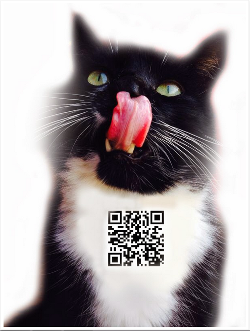
For our teaser ads, there were 2 main features that we wanted to focus on the most and these were narrative enigma and the use of kittens. We featured the kitten in 2 of our 5 teaser ads, as we did not want to over use this idea. The most effective one out of the 2 was the first one that we created. This simply featured an image of the kitten with our QR code layered on to its chest. The tongue sticking out creates a more fun and relaxed appeal, which will help in attracting our younger audience. Recently across all social media sites, there has been a growing phenomena based on cats performing amusing tricks or memes of cats. We thought that because our group is called Atomic Kitten, it would create a nice link to this public cat obsession by featuring a kitten in our adverts. The second feature was narrative engima. We thought that applying this theory to the teaser mag ads would help us to build up anticipation and keep the audience intrigued. The first ad featuring narrative enigma included an image of one of the group members facing away from the camera, holding a feminine, sassy pose. We then layered a QR code onto her lower body, to subtly reflect the Male Gaze Theory. The second ad featured an image of the whole group with their back to the camera, with an image of rose petals and candles layered on top. We reduced the opacity of this image so that you could see both images. This was one of the ads that we used to convey the romantic theme seen in the digipak and music video. The final teaser included 3 individual photos of each member holding a lit candle, which had been edited to fit together in to one complete image. We then again layered the QR code onto the middle candle, to build suspense.
 |
| Group ad |
In total, we have 4 final mag ads. These involve one individual ad for each member and then a group one. We created this as it is common for well-known artists to include more than one advertisement in the same issue of a magazine or a double page spread, to really push their product and so that audiences will be more likely to notice the advertisements. For the individual ads, we used new images of the members to add to the visual variety, and included the artist name in the same font and colours as the digipak, as I mention later on. We also included text advertising the digipak and bonus DVD, along with a small image of the digipak so make readers aware of what to look for. 2014 tour dates were also included, which can be viewed as a reflection of the groups recent reunion. The group ad that we created includes all the same text as the individual texts, as the only thing different is the image. The image we chose was one where the group are leaning on each other to signify the unity and connection between the group.
Digipak
 |
| Final digipak |
Music Video
 |
| Clicking and lip syncing |
 |
| Black and white narrative |
Our narrative section was based on a couple. This section was black & white, so that audiences could differentiate between the performance and narrative, and this element proved to work very effectively. The narrative is linear, and the romantic theme has been carried across to be included in the other 2 ancillary texts.
In What Ways Are The 3 Texts Linked?
Throughout all 3 texts, we conveyed a professional and sleek theme. This is portrayed through many different aspects:
 |
| Blue dresses on the digipak |
 |
| Blue dresses in the video |
 |
| Mag Ad - various font colours and blue dresses |
The fonts that we used can link together in other ways than just the colours. We downloaded various appropriate fonts off Dafont.com and used them for both the magazine ads and the digipak. These fonts were considered greatly before we finally decided upon which ones to use for our final products, as it was important that these fonts worked well together and gave off a professional impression to the audience. Our final products display how well these fonts compliment each other and how they work together to be aesthetically pleasing for the audience.
 |
| Studio location |
 |
| Roses and candles in the digipak |
 |
| Roses in the video |
 |
| Smiling/laughing image in the lyrics booklet |
attracted to colourful and happy texts as it stimulates their brains and this then keeps them engaged for longer. Because of this, we used the relaxed shots in the video to make them feel more comfortable when watching the video, and we again used various font colours as well as appealing photos in our digipak and mag ads to make more eye catching products to keep them interested and more inclined into remembering the information provided.
 |
| Laughing shot in the video |
In What Ways Are They Differentiated?
As much as we have tried to make our texts link together, there were some elements that we could not portray across all 3 texts:
The main feature that readers will not be able to link together is the narrative. Although we have carried the romantic theme of the video across to the ancillary texts, we found it difficult to find an effective way of linking the narrative into the ancillary texts. Although the music video is effectively promoting the digipak, it is only promoting one single on the album and so we felt it would not completely work if we included the narrative in our digipak, as readers may become confused if they are unaware of the video. For this reason, we decided it was perhaps better to keep the narrative conveyed in the music video only. Because the mag ads are also promoting the digipak, it would have again not totally linked together and flowed if we included the narrative in the ads and not the digipak. It could be argued however that by incorporating the romantic theme into all 3 texts, we have in some subtle way portrayed the narrative, as those who have seen the video may be able to see the link. This links in to Halls preferred reading and the Uses and Gratifications theory, as the audience who have seen all 3 texts combined will be able to choose how they want to read and interpret the petals and candles used throughout, and so they can decide whether there is a link there or not.
 |
| Smiling and appealing image on the lyrics booklet |
 |
| Crying shot in the video - conveys a sad narrative |
We didn't include the narrative characters in each of the texts either as we again didn't want to confuse the readers if they were unfamiliar with the video. This was also because, as mentioned earlier, the video is only promoting one track on the digipak and so the characters would be irrelevant to every other song.
What Would We Change Given More Time/Resources?
 |
| Effects in Photoshop during the editing process of the digipak |
e simply could not include any more locations due to access issues and our limited time scale.
Time management could have been improved throughout the production processes. Although we have finished everything in a relatively short period of time after re-pitching our idea, we still could have improved our time management by updating our blogs on a daily basis and blogging on things as they happen, for example after creating new rough cuts and drafts uploading them and blogging on them straight away.
 |
| Our digipak and mag ad research displayed on our blogs |
Subscribe to:
Posts (Atom)